
Architecture Presentation Board: A Complete Guide (Layout, Examples + AI)
A complete guide to designing an architecture presentation board — essential elements, layout and hierarchy, competition vs client boards, and how to speed it up with AI.
A product-minded article inside the same studio visual system as the rest of the site.
A complete guide to designing an architecture presentation board — essential elements, layout and hierarchy, competition vs client boards, and how to speed it up with AI.
")
A great architecture presentation board does one job: it makes someone — a juror, a client, a professor — understand and believe your project in seconds. The drawings can be brilliant, but if the board is cluttered or the hierarchy is unclear, the idea gets lost.
This guide covers what a presentation board needs, how to lay it out, the difference between competition and client boards, and how to produce one faster with AI.
What is an architecture presentation board?
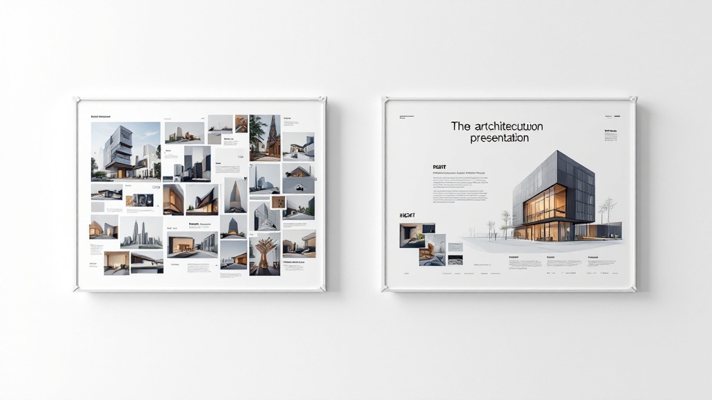
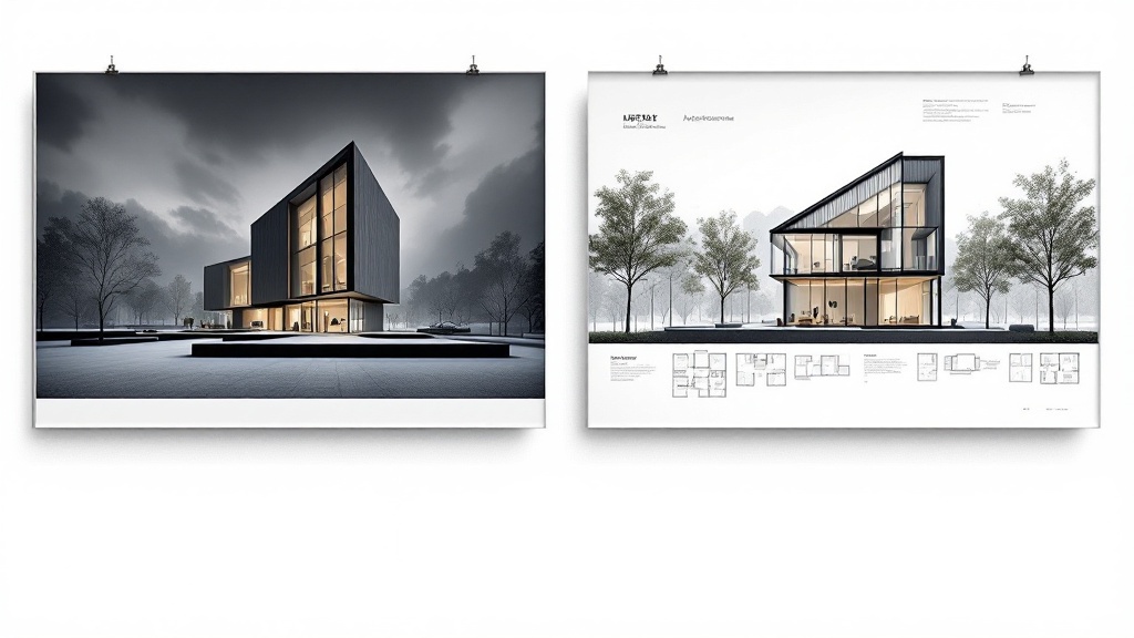
An architecture presentation board is a single composed sheet (or set of sheets) that communicates a design through drawings, renders, diagrams and text. It tells the story of a project — from concept to resolved design — in a way that can be read at a glance and explored in detail.
Good boards share a clear narrative: why the project exists, how it works, and what it looks like.
Essential elements of a strong board
Most effective boards include:
- A concept statement — one or two lines that frame the idea.
- A hero image — the render or perspective that sells the project.
- Plans and sections — the technical proof that it works.
- Analysis diagrams — site, circulation, massing, environment.
- A title and clear labels — so nothing has to be explained out loud.
Layout and hierarchy: the part most people get wrong
A board fails when everything competes for attention. Fix that with three habits:
- Use a grid. Align every image and text block to an underlying grid. It instantly reads as professional.
- Establish hierarchy. One dominant hero image, supporting drawings at medium scale, diagrams and text smallest. The eye should know where to start.
- Protect white space. Margins and gaps are not wasted — they let each element breathe and guide reading order.
Decide reading direction (usually top-left to bottom-right), keep a consistent type scale, and limit yourself to one or two fonts.
Analysis diagrams: show your thinking
Jurors and clients want to see reasoning, not just results. A short diagram strip — site analysis, circulation, massing evolution — communicates more than paragraphs of text. Keep diagrams in a single consistent visual style (line weight, color, isometric vs plan) so they read as a set.
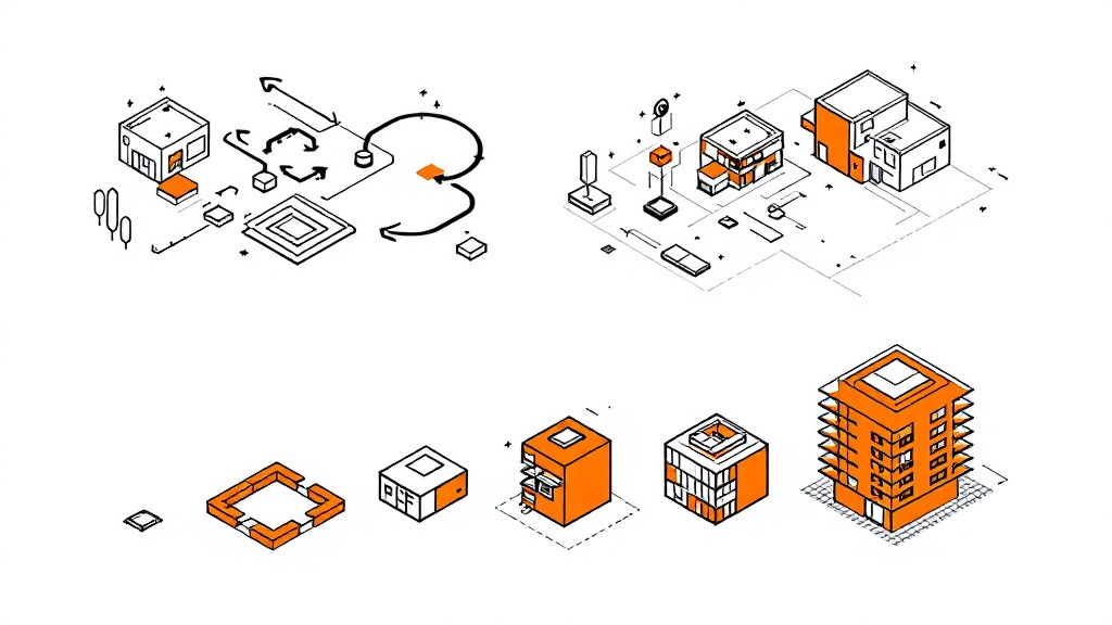
You can generate these quickly from a description or a rough sketch with the architecture sketch generator.
Competition board vs client presentation board
The same project needs different boards for different audiences:
| Competition board | Client board | |
|---|---|---|
| Goal | Stand out, evoke emotion | Build confidence, explain clearly |
| Hero | Large, dramatic render | Realistic render + plans |
| Text | Minimal, poetic | Practical, reassuring |
| Density | High, expressive | Calm, easy to follow |
Speed it up with AI
Assembling a board — generating renders, drawing diagrams, fitting everything onto a grid — eats hours. AI can compress that:
- Generate concept renders from a sketch or description with the architecture generator.
- Produce analysis diagrams in a consistent style.
- Compose the board by dropping the pieces onto a grid layout.
- Iterate fast — regenerate a single render without rebuilding the whole sheet.
- Export print-ready output for A1/A2 boards.
This keeps your time on design decisions instead of layout labor.
Templates and export
If you prefer manual control, start from an architecture presentation board template (InDesign, PSD or Figma) and drop your drawings in. Whichever route you take, export at the right resolution for your sheet size — boards are often printed at A1 or A2, so work at 150–300 DPI and check legibility from a distance.
FAQ
What should an architecture presentation board include?
A concept statement, a hero render, plans and sections, analysis diagrams, and clear titles and labels — all arranged on a consistent grid.
What size is an architecture presentation board?
Competition and academic boards are commonly A1 or A2, in portrait or landscape. Design at 150–300 DPI so it stays sharp when printed large.
How do I make my presentation board stand out?
Lead with one strong hero image, enforce a clear hierarchy, keep generous white space, and use diagrams to show your reasoning.
Can AI help make an architecture presentation board?
Yes. AI can generate renders and diagrams and help compose them onto a grid, cutting hours of layout work.
Build your board faster
Turn a concept into a polished architecture presentation board without the layout grind. Generate renders and diagrams, compose them on a clean grid, and export print-ready. Try the architecture generator →
More Posts
More Posts

AI Virtual Staging for Real Estate: The 2026 Realtor Playbook
When AI virtual staging wins vs traditional staging, MLS disclosure rules, and the per-listing economics that make it work for every vacant listing.

SketchUp to Photorealistic Render with AI: A Practical 2026 Workflow
How to take a SketchUp model to a photorealistic render in under a minute using AI. Export settings, prompt patterns, and where this workflow beats — and where it does not beat — V-Ray and Enscape.

Sketch to Render AI: How Architects Turn Hand Drawings into Photorealistic Renders in 2026
A practical guide to AI sketch-to-render for architects, students, and designers. What it does, how it fits real workflows, and where it still falls short.
Get the next product and workflow notes in your inbox
Newsletter
Join the community
Subscribe to our newsletter for the latest news and updates